English
  Português
Presenting IT project metrics, especially to non-technical areas such as business teams, is a common challenge for technology managers. It’s not enough to simply show numbers; technical data must be translated into information that supports decision-making. In many companies, reports are confusing or poorly aligned with what really matters to stakeholders.
According to the Project Management Institute (PMI), companies that align IT metrics with business goals are 70% more likely to achieve above-average results. This shows that communicating metrics clearly has a direct impact on organizational performance. In this text, we’ll explore some best practices for making stronger presentations about your project’s progress, all with the expertise from NextAge.

1) Know your crowd
Before creating any presentation, it’s essential to understand who will be reviewing the data. Executives and directors are typically interested in information that highlights business impact, such as deadlines, costs, risks, and return on investment. Managers and operational leaders, on the other hand, need more details about delivery speed, team productivity, and project bottlenecks. For non-technical audiences, such as marketing or finance, explanations must be even more objective and free of jargon.
Adapting the presentation for each profile is one of the most important best practices. This doesn’t mean creating separate reports for each audience, but structuring the information so that every stakeholder can easily find what they need to make better decisions.
2) Choose metrics that matter to the business
Another common mistake is trying to show everything at once. An overload of technical data can confuse the audience and shift attention away from the most important message. It’s better to carefully select metrics that directly impact business strategy and, when needed, leave supporting information as attachments.

Some metrics are especially relevant for providing real visibility into project progress, such as:
- Team performance: shows how many sprints were completed on time.
- Delivered Scope: compares the scope actually delivered against what was planned.
- Team Speed: helps estimate how much can be delivered in upcoming sprints, adjusting expectations for deadlines and capacity.
- Rework Rate: shows the percentage of adjustments per sprint. This is critical to highlight quality issues or requirement gaps.
- Project Health: a broader metric that combines different indicators to provide a consolidated view of overall status.
- Throughput: shows how many items were delivered per sprint.
- Pending Items: highlights tasks still in progress.
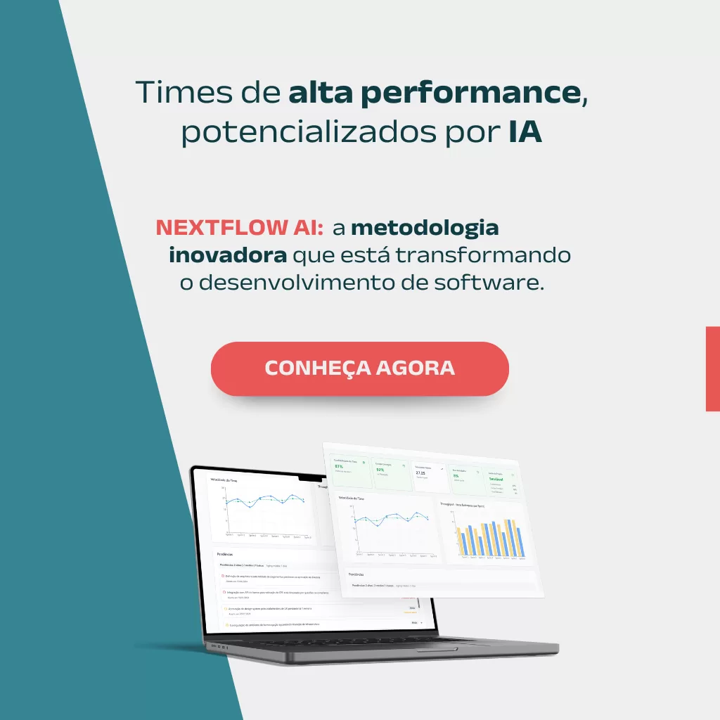
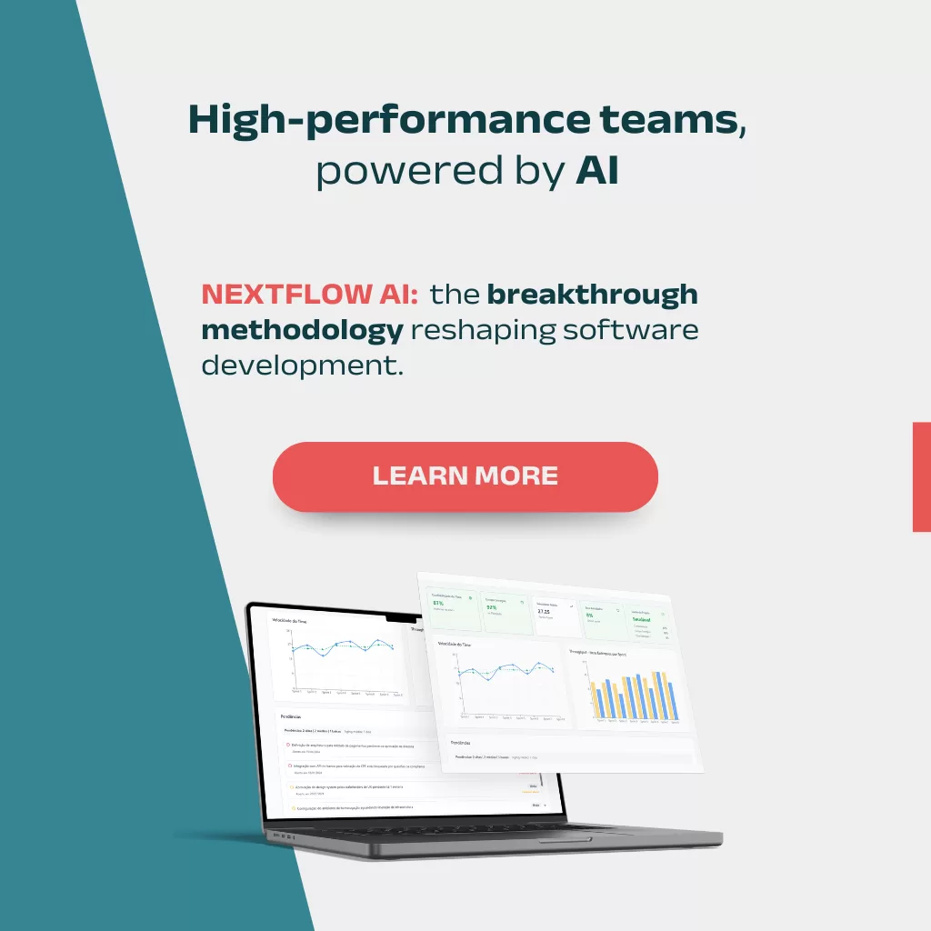
NextAge knows the importance of these indicators and has developed a new service that offers a dedicated dashboard to support project management. These metrics were designed based on our 18 years of experience in software development. This innovation reinforces our role as a partner, providing the expertise and technologies needed to achieve the best results.
3) Explain all the numbers
Isolated data helps no one. For a presentation to be effective, each metric must be contextualized. This means showing trends by comparing previous periods, relating numbers to agreed-upon targets, and explaining deviations. For example, if the Rework Rate increased, clarify whether it was due to scope changes, communication issues, or quality problems.
Whenever possible, translate the impact of numbers into business reality. An increase in Pending Items, for example, may signal the need to expand the team or renegotiate deadlines with other departments. According to a Gartner study, companies that contextualize their metrics improve the efficiency of strategic decision-making by 32%.

4) Invest in clear visuals
The way numbers are presented directly affects how well the message is understood. Lengthy reports and dashboards filled with complex charts often confuse more than they clarify. A good practice is to prioritize clean visualizations, focused on the indicators that matter most to each audience.
Tools that consolidate information from different sources and generate dynamic dashboards make this process much easier. Services like NextFlow AI, for example, allow IT managers to visualize metrics clearly with real-time automatic updates.

5) Keep It Consistent
The frequency of presentations also plays a big role in communication success. For executives, monthly or quarterly reports are usually enough. Operational teams, however, benefit from weekly or bi-weekly meetings with more detailed metrics.
Maintaining a consistent structure is just as important as frequency. A familiar format helps stakeholders know what to expect, compare results across periods, and identify trends more effectively.
6) Focus on Decision-Making
The ultimate goal of presenting metrics is to support strategic decisions. Each indicator shown should answer a clear question, such as: Are we on schedule? Is the investment generating the expected return? Are there risks of delays or cost increases? At the end of the presentation, it’s essential to provide recommendations based on the data, such as reallocating resources, adjusting timelines, or reprioritizing tasks.
NextFlow AI: More visibility for IT project management

As IT projects become increasingly complex, managing them without data has become nearly impossible. In this context, NextFlow AI, developed by NextAge, is the ideal choice for managers seeking efficiency, reduced rework, and greater clarity on project progress.
In short, presenting IT metrics requires organization, clarity, and strategy. Having access to relevant indicators, creating objective visualizations, and maintaining consistency in communication are essential steps to make these presentations more effective.
👉Get to know more in your website